Scripture Art and Various Creative Conceptions Born of Love
- Thread starter Magenta
- Start date
-
Christian Chat is a moderated online Christian community allowing Christians around the world to fellowship with each other in real time chat via webcam, voice, and text, with the Christian Chat app. You can also start or participate in a Bible-based discussion here in the Christian Chat Forums, where members can also share with each other their own videos, pictures, or favorite Christian music.
If you are a Christian and need encouragement and fellowship, we're here for you! If you are not a Christian but interested in knowing more about Jesus our Lord, you're also welcome! Want to know what the Bible says, and how you can apply it to your life? Join us!
To make new Christian friends now around the world, click here to join Christian Chat.

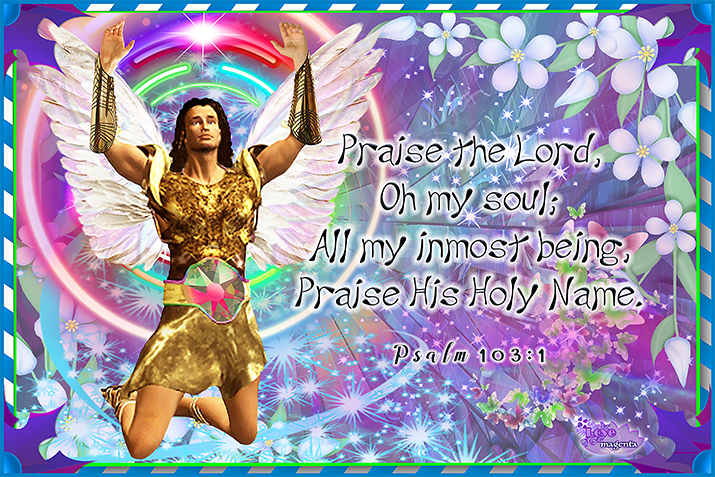
I began this Psalm 103:1 panel December 7, 2020.
The figure is a fairly poor quality file, but there was nothing similar
I could find after looking for quite a while. I did try changing his tunic
and also added gauntlets, and tried to reduce the overall blurriness
of it, but generally felt a little lost working with a male figure LOL
Definitely not one of my favorites
-
1
- Show all

I designed this Psalm 46:1-3 + 10, 11 panel December 12, 2020
The musical rendition of @SoulWeaver 's same Psalm stood out for me
the very first time I listened through the songs on Bless The Rain Project
-
1
-
1
- Show all
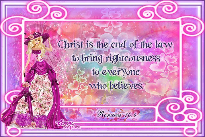

These two panels (Romans 10:4 and Isaiah 12:2) were designed around the middle
of November, 2020. Yes, they are very similar, which caused some problems when
I mis-named one of them, then somehow lost the original of one, and had to redo
a whole lot of work on both of them
-
1
- Show all
Why is your picture so small that I can't read clearly


I size my files to the maximum allowed, with is just under 1M.
Otherwise on phones they would only show up as a little "x" in a tiny box.
I size my image files for posting to 715 pixels wide, which is quite a good size
Magenta, that panel is absolutely gorgeous! 🌹🥰💐
Thank you muchly, Kim  I fiddled around with it a while for quite and posted various versions of it over the last couple of months... it is the construction of the figure that often takes the most time, but even getting the fonts right can be a painstaking endeavor. Space is limited for text, but with this one it seemed there was almost too little text LOL. I did at first have the rest of the Psalm 28:7 on it, but that seemed to detract too much from the focus on the main verse, and looked unbalanced with so much smaller font below the large font
The bright colors and patterns would definitely help me remember the Scripture set against them a little better, as I am very visual and, in order to memorize something, I have to be able to picture it in my mind.
I could see using that panel as a "Scriptural Flash Card" -- a wallpaper panel against which one could up different verses they wanted to meditate upon, etc.
Fantastic work.
-
1
- Show all

